I Updated my Library for the Multilingual Custom Admonition:
I spent the last two days tinkering around in Space-Style and Space-Lua until I figured it out how to add a bottom border. now i finally have a variant I like, and i think @mjf you might like it too.
I added the option to customize the border and inside padding using variables. so everyone can freestyle it to their liking.
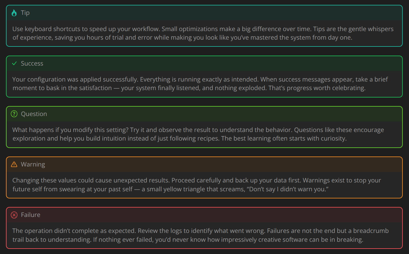
I switched it back to the “old” icons (sorry but I liked them better)
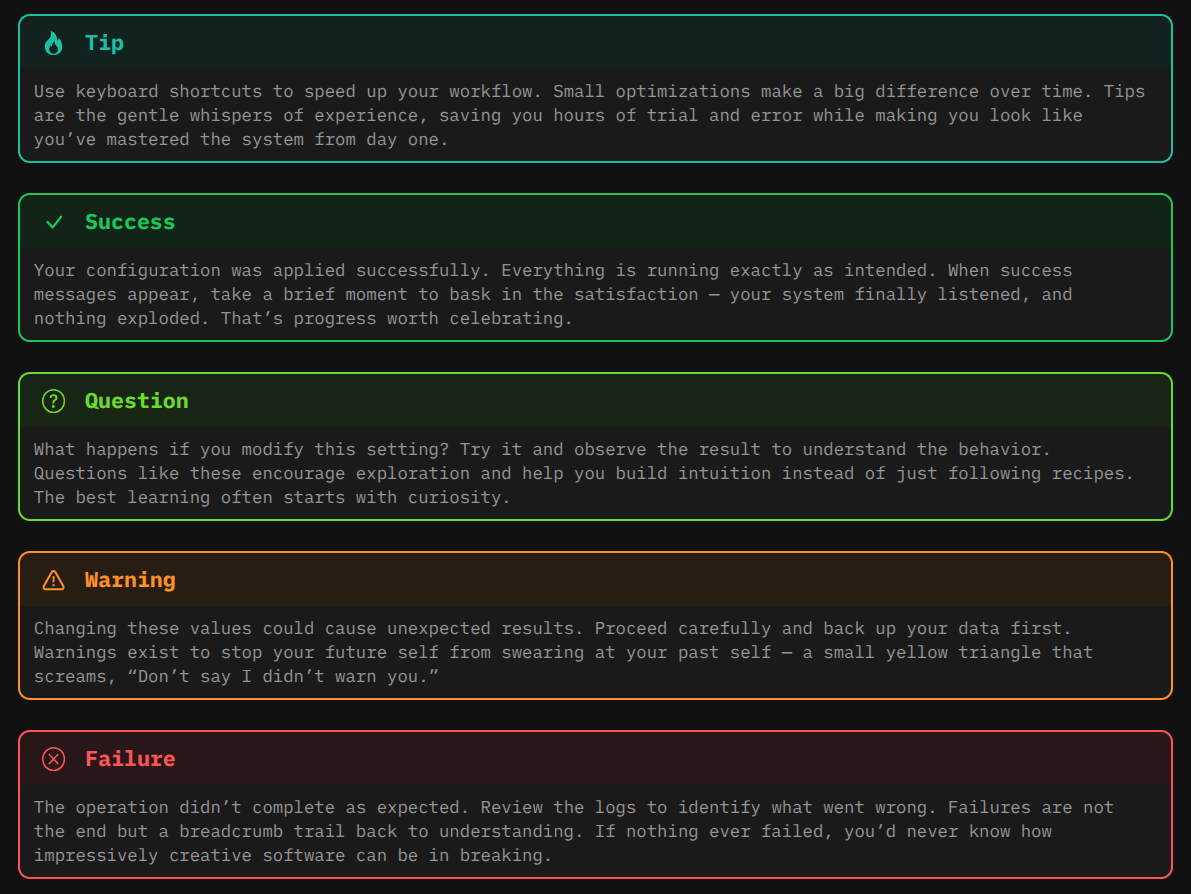
Here are just a couple of styling examples:
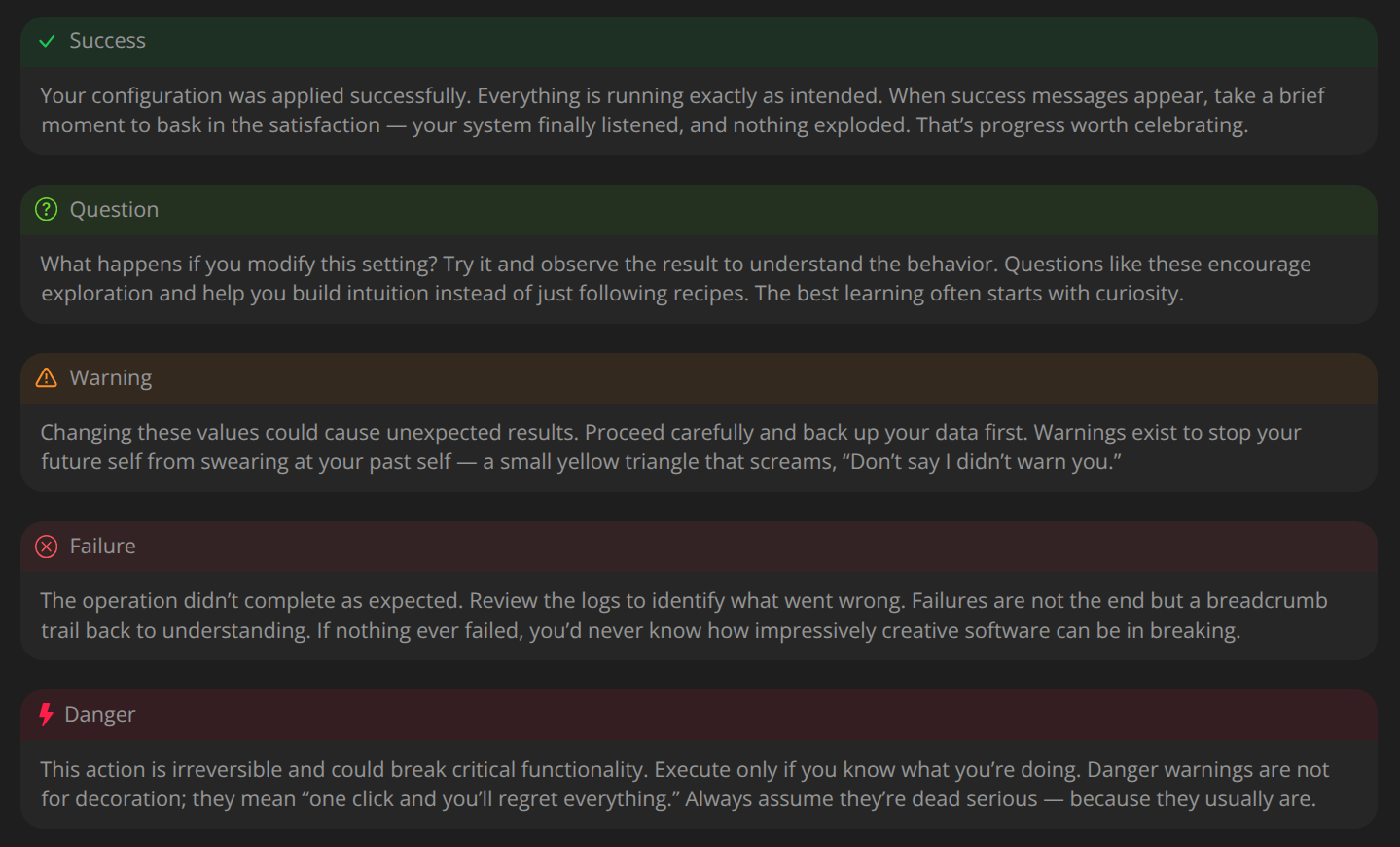
Default:
title padding 0.5em
text padding: 1em
border width: 2px
border style: solid
border radius: 10px
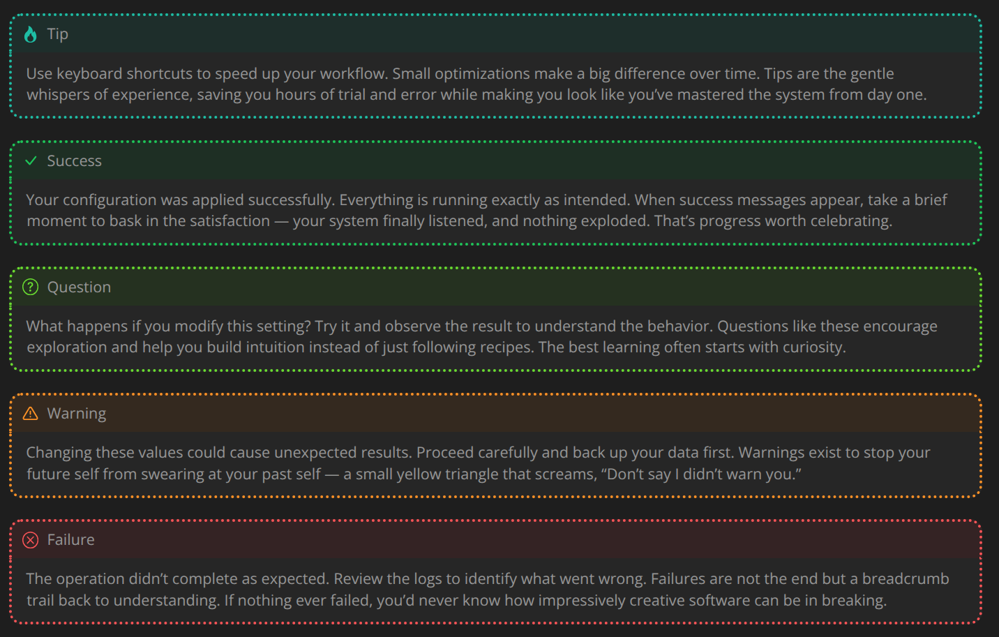
Dotted:
title padding 0.5em
text padding: 1em
border width: 4px
border style: dotted
border radius: 15px
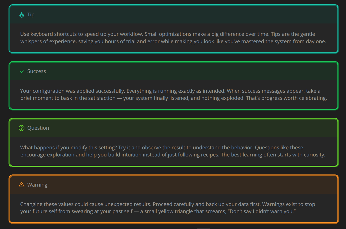
Wide Padding and Ridge style:
title padding 1em
text padding: 2em
border width: 6px
border style: ridge
border radius: 15px
No Border:
title padding 0.5em
text padding: 1em
border width: 2px
border style: none
border radius: 20px
In the future i might also add the font-size variables too, so you can customize that too.
[EDIT]: Added also the possibility to easily customize the sIze & weight of the title, and the size of the normal admonition text.