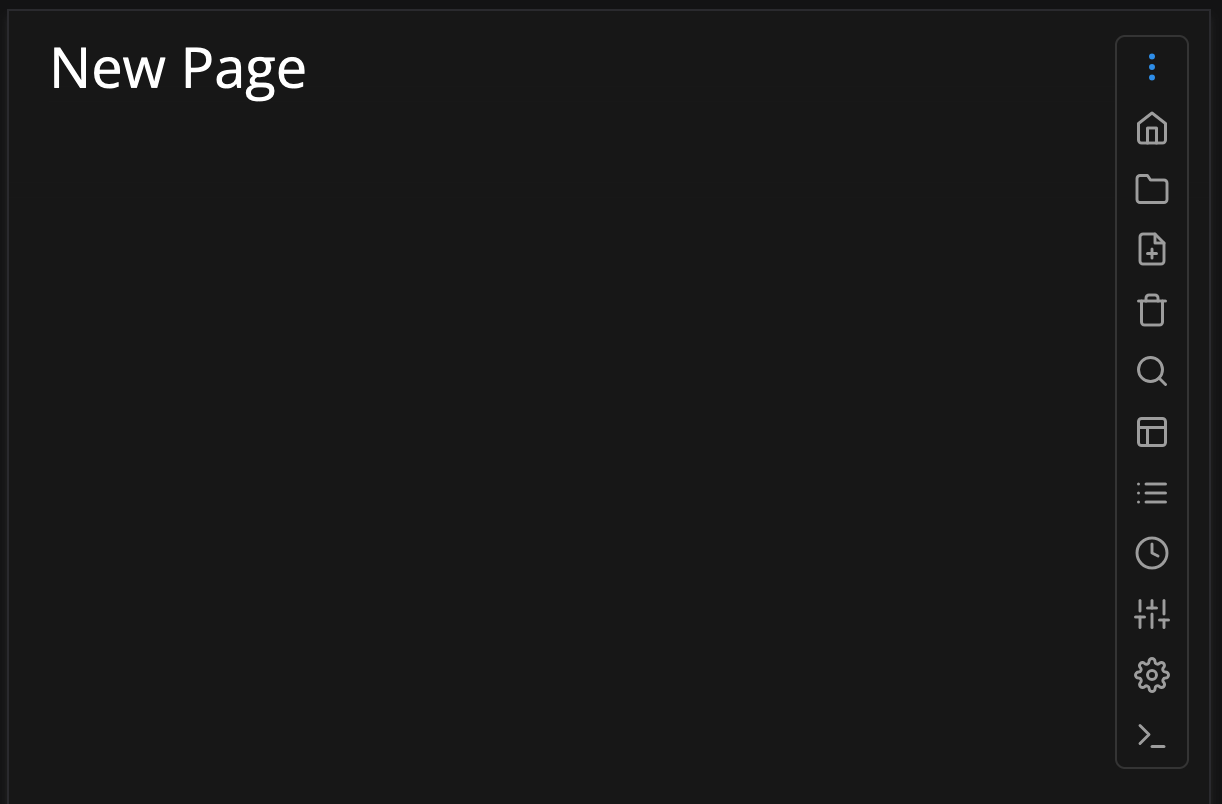
/*Mobile Collapsible Menu*/
@media only screen and (max-width: 600px) {
  #sb-top .sb-actions {
    position: fixed;
    border-radius: 5px;
    border: 1px solid #444 ;
    top: 12px;
    right: 20px;
    width: 2.2rem;  /* Collapsed width */
    background: rgba(var(--root-background-color), 0);
    backdrop-filter: blur(8px); /* tinted glass-like blur for the background */
    overflow: hidden;  /* Hide overflowing content */
    flex-direction: column;
    align-items: center;
    z-index: 10; /* Ensure the buttons stay on top */
  }
  /* Button styling */
  .sb-actions button:not(.sb-code-copy-button) {
    display: block;
    height: 1.4rem;
    text-align: center;
    margin: 4px 0;
    padding: 2px 0;
  }

  /* Hide all buttons except the last one */
  .sb-actions a:not(:first-of-type) {
    display: none;
  }
  /* Show all buttons when hovering */
  #sb-top .sb-actions:hover a {
     display: block;
  }
}
for this to work I also use an empty action button as the first action button,
and also recommend hiding the Sync and Edit buttons in the space-config:
hideSyncButton: true
hideEditButton: true

actionButtons:
- icon: more-vertical
  command: "{[]}"
  description: Open Tool Menu
If you also want to use this menu on your desktop or your mobile has a wider screen increase the max-width: 600px) to your liking.
Feel free to share your thoughts or improvements in the comments bellow.
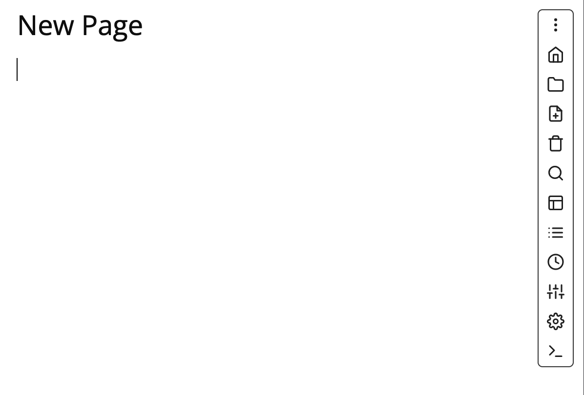
I’ve added a little animation and some shadow effect to the collapsible vertical menu to feel a little bit smoother, and also remove the 1st “Menu Button” when on Desktop/Landscape.
Here’s the Preview:
And here are the modified space-style & space-config:
space-style:
/*.   Mobile Collapsible Menu V 1.2   */


/*Hide menu button in Landscape mode*/
@media only screen and (min-width: 600px) {
   .sb-actions a:first-of-type {
     display: none;
   }
}

@media only screen and (max-width: 600px) {

/* Position the menu relative to .cm-scroller */
  .cm-scroller {
    position: relative; /* This is the positioning context */
}
#sb-top .sb-actions {
  position: absolute;  /* Now positioned relative to .cm-scroller */
  top: 3px; /* 12px from the top of .cm-scroller */
  right: 20px; /* 20px from the right edge of .cm-scroller */
  border-radius: 5px;
  border: 1px solid #444;
  width: 2.8rem;  /* Collapsed width */
  background: rgba(var(--root-background-color), 1);
  backdrop-filter: blur(20px);
  overflow: hidden;
  flex-direction: column;
  align-items: center;
  z-index: 10;  /* Ensure the buttons stay on top */
  transition: max-height 0.3s ease-in-out, box-shadow 0.3s ease-in-out;
  max-height: 2.2rem; /* Initial collapsed height */
}

  #sb-top .sb-actions:hover {
    max-height: 33rem; /* Expanded height (adjusted for 13 buttons) */
    box-shadow: 0px 2px 15px rgba(0, 0, 0, 0.5); /* Smooth shadow on hover */
  }

  /* Button styling and size */
  .sb-actions button:not(.sb-code-copy-button) {
    display: block;
    height: 1.8rem;
    text-align: center;
    margin: 4px 0;
    padding: 4px 0;
  }

  /* Initially hide buttons */
  .sb-actions a:not(:first-of-type) {
    opacity: 0; /* Start as hidden */
    transform: translateY(-5px);  /* Slightly shifted upward */
    transition: opacity 0.05s ease-in-out 0.3s, transform 0.3s ease-in-out 0.05s;
  }

  /* Show all buttons with animation when hovering */
  #sb-top .sb-actions:hover a {
    opacity: 1;
    transform: translateY(0);
  }
}
space-config - for the menu button and hidden Sync&Edit button:
## UI TWEAKS
hideSyncButton: true
hideEditButton: true
mobile: false

# Add the "empty"-action button as the first
actionButtons:
- icon: more-vertical
  command: "{[]}"
  description: Open Tool Menu
Well until this or similar makes into the core CSS, you can use this in your space-style configuration.
That is what I love the most in silverbullet, that It comes as simple as possible, and you can extend and customize it for your need.
Feel free to use it in your instance, and give feedback if something is still buggy.
If somebody would be up for this, I’d very much like to include this in the main distribution of SB. I’m no CSS expert, but the limited horizontal space on mobile is an absolute usability pain for me. If somebody could port this into a PR on the main repo I’d be very grateful.
The Copy to clipboard button disappears along with the Open Tool Menu button.
You need to add #sb-top wherever you change buttons with the sb-actions class, since the same class is used for the Copy to clipboard button and it disappears too.
space-style:
```space-style
/*.   Mobile Collapsible Menu V 1.2   */

/*Hide menu button in Landscape mode*/
@media only screen and (min-width: 600px) {
  #sb-top .sb-actions button:first-of-type {
    display: none;
  }
}

@media only screen and (max-width: 600px) {

  /* Position the menu relative to .cm-scroller */
  #sb-top .cm-scroller {
    position: relative; /* This is the positioning context */
  }
  #sb-top .sb-actions {
    position: absolute;  /* Now positioned relative to .cm-scroller */
    top: 3px; /* 12px from the top of .cm-scroller */
    right: 20px; /* 20px from the right edge of .cm-scroller */
    border-radius: 5px;
    border: 1px solid #444;
    width: 2.8rem;  /* Collapsed width */
    background: color-mix(in srgb, var(--top-background-color) 90%, transparent);
    backdrop-filter: blur(20px);
    overflow: hidden;
    flex-direction: column;
    align-items: center;
    z-index: 10;  /* Ensure the buttons stay on top */
    transition: max-height 0.3s ease-in-out, box-shadow 0.3s ease-in-out;
    max-height: 2.2rem; /* Initial collapsed height */
  }

  #sb-top .sb-actions:hover {
    max-height: 33rem; /* Expanded height (adjusted for 13 buttons) */
    box-shadow: 0px 2px 15px rgba(0, 0, 0, 0.5); /* Smooth shadow on hover */
  }

  /* Button styling and size */
  #sb-top .sb-actions button:not(.sb-code-copy-button) {
    display: block;
    height: 1.8rem;
    text-align: center;
    margin: 4px 0;
    padding: 4px 0;
  }

  /* Initially hide buttons */
  #sb-top .sb-actions a:not(:first-of-type) {
    opacity: 0; /* Start as hidden */
    transform: translateY(-5px);  /* Slightly shifted upward */
    transition: opacity 0.05s ease-in-out 0.3s, transform 0.3s ease-in-out 0.05s;
  }

  /* Show all buttons with animation when hovering */
  #sb-top .sb-actions:hover a {
    opacity: 1;
    transform: translateY(0);
  }
}
```
Minor UI request. Is it possible to move the sync progress icon outside the menu? Currently if a large sync is in progress, you can’t see the status/progress unless you open the menu.
I’ll have a look to see if that’s easy to achieve.
Currently they’re all in the same container. I could move the progress icon up, but then it will look weird if you hover and see the three dots below it. So that’s barely a solution.
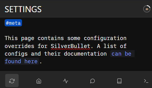
Alternatively, if it’s very important, you can use the setting mobileMenuStyle: bottom-bar. This keeps all icons visible at all times, but moves them to the bottom on smaller screens.

 Nice!
Nice!
 So that’s barely a solution.