Hey all,
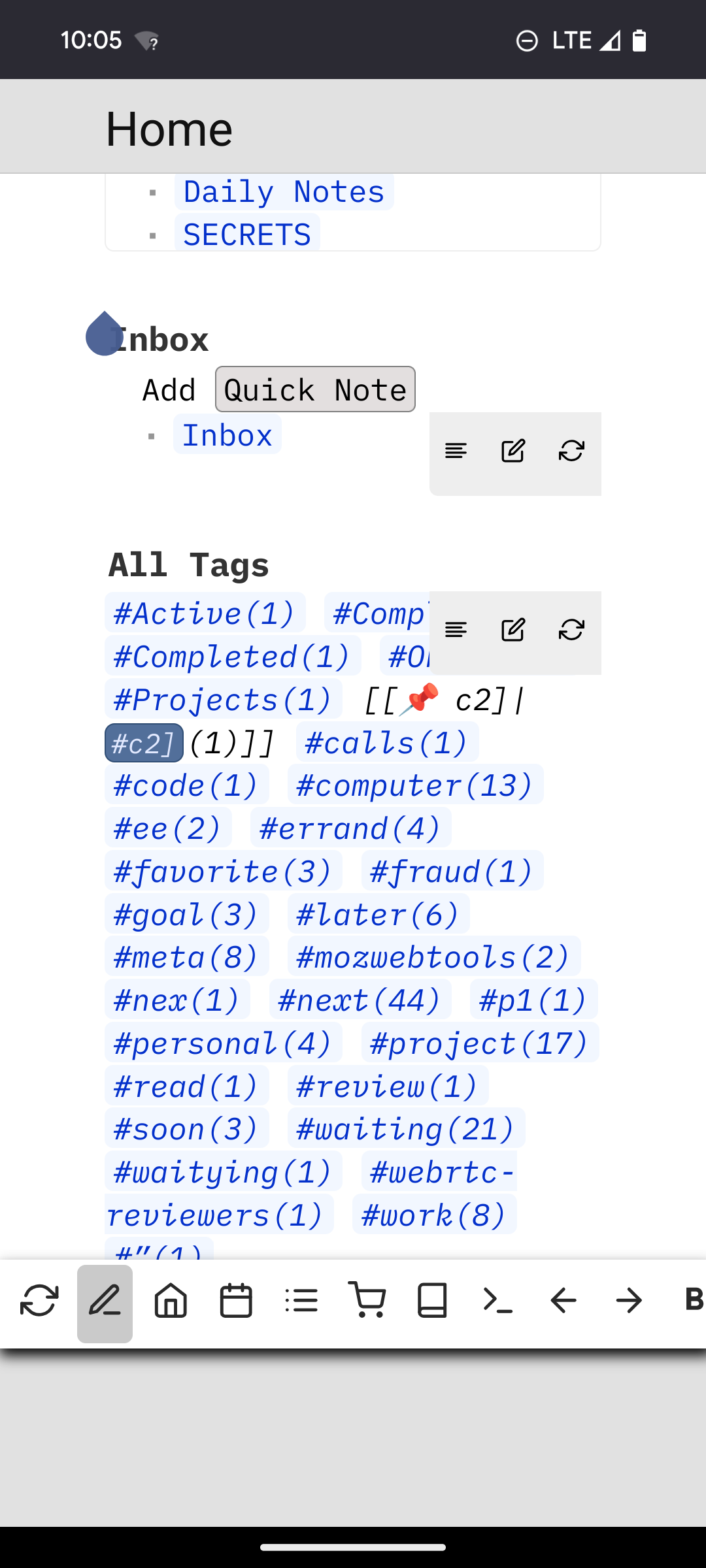
I created a custom style using space-style that allows to display the toolbar in a manner that better fits mobile devices like smartphones. It moves the toolbar to the bottom of the screen and makes action buttons a little bigger so they are easier to reach and hit. When more buttons are displayed than the width can hold, the toolbar can be scrolled horizontally. The style is only enabled on small screens, so it won’t affect the desktop view, works nice in conjunction with action buttons that have mobile: True enabled.
I guess to improve this further it would be nice to split the toolbar into two sections, a more generic one at the top right as it is now (for things like, sync, home, etc) and an optional editor toolbar that can be placed above or below the content based on device size.
Screenshots
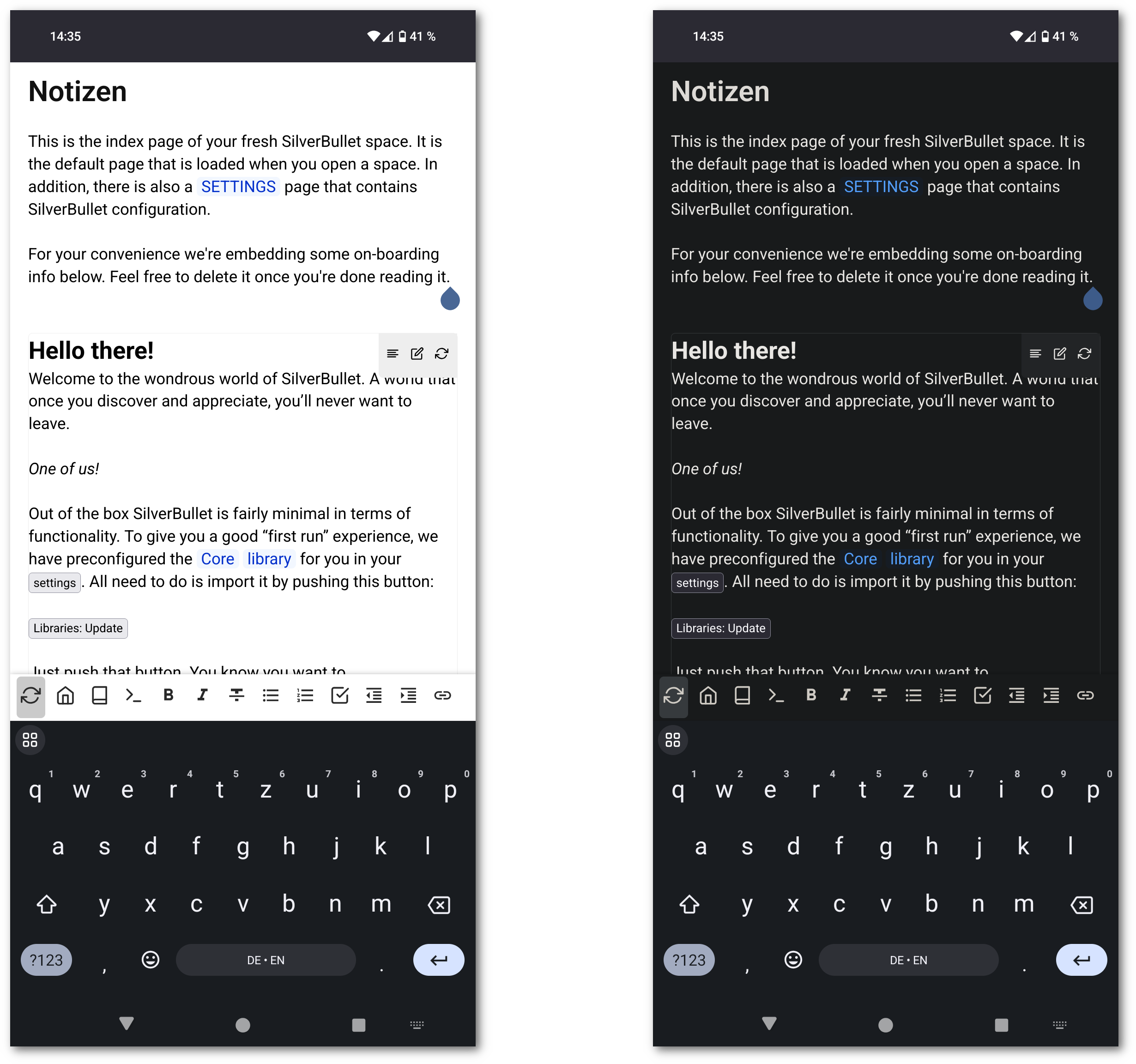
Full Example
Custom style:
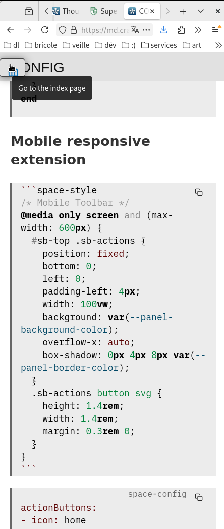
```space-style
/* Mobile Toolbar */
@media only screen and (max-width: 600px) {
  #sb-top .sb-actions {
    position: fixed;
    bottom: 0;
    left: 0;
    padding-left: 4px;
    background: white;
    width: 100vw;
    overflow-x: auto;
    box-shadow: 0px 4px 8px black;
  }
  .sb-actions button svg {
    height: 1.4rem;
    width: 1.4rem;
    margin: 0.3rem 0;
  }
}
```
Buttons as shown in screenshot:
```space-config
actionButtons:
- icon: home
  command: "{[Navigate: Home]}"
  description: "Go to the index page"
- icon: book
  command: "{[Navigate: Page Picker]}"
  description: Open page
- icon: terminal
  command: "{[Open Command Palette]}"
  description: Run command
# Mobile only buttons
- icon: md-format-bold
  command: "{[Text: Bold]}"
  description: "Bold"
  mobile: true
- icon: md-format-italic
  command: "{[Text: Italic]}"
  description: "Italic"
  mobile: true
- icon: md-format-strikethrough
  command: "{[Text: Strikethrough]}"
  description: "Strikethrough"
  mobile: true
- icon: md-format-list-bulleted
  command: "{[Text: Listify Selection]}"
  description: "List"
  mobile: true
- icon: md-format-list-numbered
  command: "{[Text: Number Listify Selection]}"
  description: "List"
  mobile: true
- icon: check-square
  command: "{[Turn into task]}"
  description: "Task"
  mobile: true
- icon: md-format-indent-decrease
  command: "{[Outline: Move Left]}"
  description: "Dedent"
  mobile: true
- icon: md-format-indent-increase
  command: "{[Outline: Move Right]}"
  description: "Indent"
  mobile: true
- icon: md-link
  command: "{[Text: Link Selection]}"
  description: "Link"
  mobile: true
```