If you have fat fingers like me, or have problems taping the tiny buttons in the Find-on-Page /Bottom-Search bar this might be the CSS [space-style] snippet for you.
I also made it to be compatible with Dark/Light Theme.
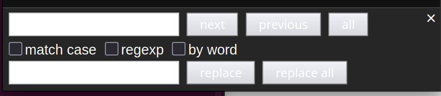
Here are the comparison between stock and new styling:
MobileView - before:
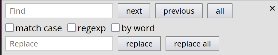
MobileView - after:
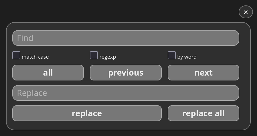
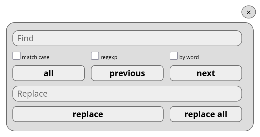
Here are the two modern normal/desktop views:
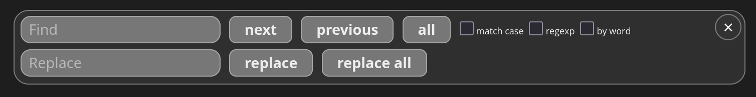
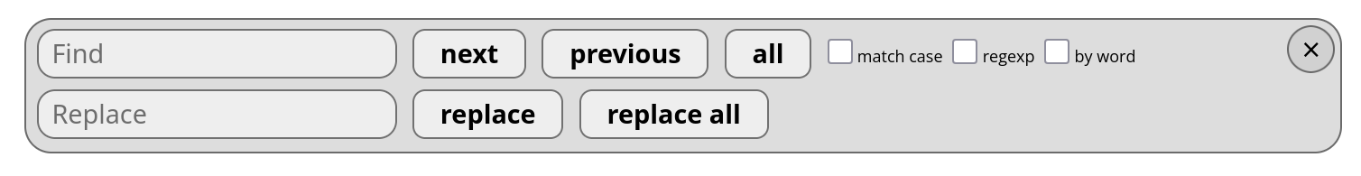
And finally here is the snippet:
/* ------Theme Color Variables-----*/

/* Dark theme colors */
html[data-theme="dark"] {
  --editor-panels-bottom-color: #eee;
  --editor-panels-border-color: #eee6;
  --editor-panels-bottom-background-color: #333c;
  --editor-panels-bottom-textfield-background: #777;
}

/* Light theme colors */
html[data-theme="light"] {
  --editor-panels-bottom-color: #000;
  --editor-panels-border-color: #333a;
  --editor-panels-bottom-background-color: #ccca;
  --editor-panels-bottom-textfield-background: #eee;
}


/*------ Editor Container Styling------*/

/* Main editor height */
#sb-main .cm-editor {
  height: 100%;
}

#sb-main .cm-editor .cm-scroller {
  padding-bottom: 15em;
}

/* Panels container */
#sb-editor .cm-panels {
  max-width: 730px;
  width: 90%;
  border-radius: 15px;
  justify-content: center;
  height: auto ;
  padding-bottom: 0 ;
  border: 1px solid var(--editor-panels-border-color);
  backdrop-filter: blur(10px);
  background-color: var(--editor-panels-bottom-background-color);
  z-index: 10;
}


/*--------Bottom Panel Elements-------*/

#sb-editor .cm-panels-bottom {
  position: absolute ;
  bottom: 15px !important;
  left: 15px ;
  top: auto ;
  right: auto ;

}

/*------ Search Panel Styling ------*/

/* Close button */
.ͼ1 .cm-panel.cm-search [name="close"] {
  top: 3px;
  right: 3px;
  padding-left: 7px;
  padding-right: 7px;
  border-radius: 100%;
  background-color: var(--editor-panels-bottom-background-color);
  border: 1px solid var(--editor-panels-border-color);
}
/* Close button hover */
.ͼ1 .cm-panel.cm-search [name="close"]:hover {
  background-color: #777;
}

/*  Buttons and Textfields (.ͼ2) */

/* Checkbox labels */
.ͼ1 .cm-panel.cm-search label {
  font-size: 50% ;
}

/* Buttons */
.ͼ2 .cm-button {
  font-size: 80%;
  font-weight: 600;
  border-radius: 7px;
  color: var(--editor-panels-bottom-color);
  background-image: none;
  border: 1px solid var(--editor-panels-border-color);
  background-color: var(--editor-panels-bottom-textfield-background);
}

.ͼ2 .cm-button:hover {background-color: var(--editor-panels-bottom-background-color);
}


/* Textfields */
.ͼ2 .cm-textfield {
  font-size: 80%;
  color: var(--editor-panels-bottom-color);
  background-color: var(--editor-panels-bottom-textfield-background);
  border-radius: 10px;
  border: 1px solid var(--editor-panels-border-color);
}


/*--------- Mobile Styling --------*/
@media (max-width: 600px) {
  #sb-editor .cm-panels-bottom {
    width: 95% ;
    position: absolute ;
    left: 0 ;
    right: 0 ;
    bottom: 10px ;
    margin: 0 auto ;
    display: flex !important;
    justify-content: center ;
    align-items: flex-start ;
  }

  .cm-panel {
    position: relative ;
    margin: 0 auto ;
    padding: 10px !important;
    display: grid;
    width: 100%;
    grid-template-columns: 1fr 1fr 1fr ;
    gap: 2px ;
    grid-template-areas:
      "search search search"
      "ch_case ch_re ch_word"
      "b_all b_prev b_next"
      "replace replace replace"
      "b_repl b_repl b_replA";
    align-items: center ;
    justify-content: center ;
    box-sizing: border-box !important;
  }

/* Grid area assignments for form elements */
  .cm-panels input[name="search"] { grid-area: search; }
  .cm-panels input[name="replace"] { grid-area: replace; }

  label:has(input[name="case"]) { grid-area: ch_case; }
  label:has(input[name="re"]) { grid-area: ch_re; }
  label:has(input[name="word"]) { grid-area: ch_word; }

  .cm-panels .cm-button[name="next"] { grid-area: b_next; }
  .cm-panels .cm-button[name="prev"] { grid-area: b_prev; }
  .cm-panels .cm-button[name="select"] { grid-area: b_all; }

  .cm-panels .cm-button[name="replace"] { grid-area: b_repl; }
  .cm-panels .cm-button[name="replaceAll"] { grid-area: b_replA; }

/* Close button adjustments for mobile */
  .cm-panel button[name="close"] {
    position: absolute !important;
    top: -30px !important;
    right: -5px !important;
    font-size: 15px !important;
    cursor: pointer !important;
  }
}
I know it’s not perfect, but I hope it’ll be helpful for you too and you’ll like it.
PS: Sorry for abusing the !important attribute 
 !
!