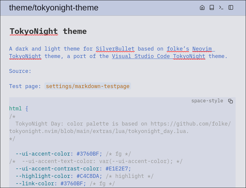
Does anyone have a test markdown file for testing themes? Something along the same lines as THIS.
I am using theme.scss to model light and dark themes. The descriptive names are awesome but I don’t now how to trigger many of them much less what they mean. My failure not silverbullets.
What you can do is copy/paste your current css into ChatGPT, and ask it to convert the Hex to OKLCH, then you can tweak the lightness, chroma and hue values manually to your liking, much easier than with hex trying to match colors and especially for contrast and perceived lightness OKLCH is the best.
[EDIT] Just looking at your theme, in my opinion there is too much blue.
if you watched the videos i sent you, you’ve also seen that a UI should be as clear as possible and there should be ui accents to differentiate certain objects. But your Paragraph text is blue/light blue. As your main text color you shouldn’t use a light accent color.
Maybe try to tone it down a little by 70% darker, and alternatively you can make the headings with the accent colors.
For text and background try to stay at the opposite ends of you color palette, and not pick colors from within.
Honestly, I prefer dark themes but your observation would probably be true for tokyonight-night as well.
I agree, the first video does a good job explaining how to create palettes. I am not ignoring his guidance so much as nailing down tokyonight then I will tweak the colors. I do appreciate you calling it out. I was thinking there was too much blue, too, but hearing it from you is validation. I appreciate the input and please continue sharing. I have no art or very little UI design experience.
