Hello everyone, I just wanted to share my SilverBullet setup.
I am new to SilverBullet after having tried many note-taking tools. I use Google Keep for quick notes and SB for my extensive notes. I am still transitioning from OneNote; previously, I was a user of Obsidian, Notion, and Joplin. While most of these tools do a fine job, there was always something missing or problematic for my workflow. A crucial piece of the puzzle for me was simplicity and platform independence. While Obsidian came very close, I did not like that it has no free syncing, and tools like Git or OneDrive sync seemed too unwieldy for me.
What I like about SB is how simple it is, yet as complex as I want it to be. I love that I can sync my SB notes to my Docker instance running at home and use the new native apps on Windows and Linux. I also love the fact that my config travels with me no matter where I use the app, be it in the browser or the native apps. I briefly tried SB v1 but did not like it. Funnily enough, Gemini is responsible for recommending that I try SB v2.
I had a very customized setup of SB until two weeks ago. After the release of the official SB+, I decided to tone it down to a minimal and more default setup.
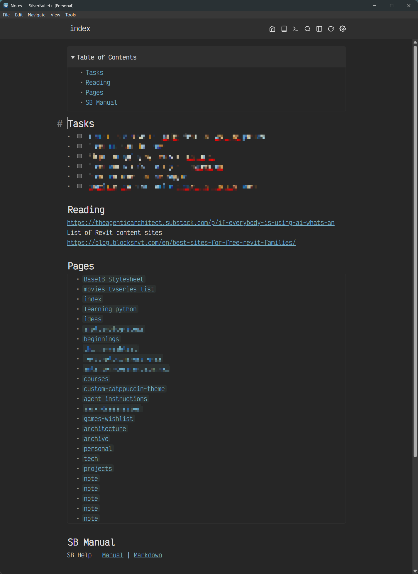
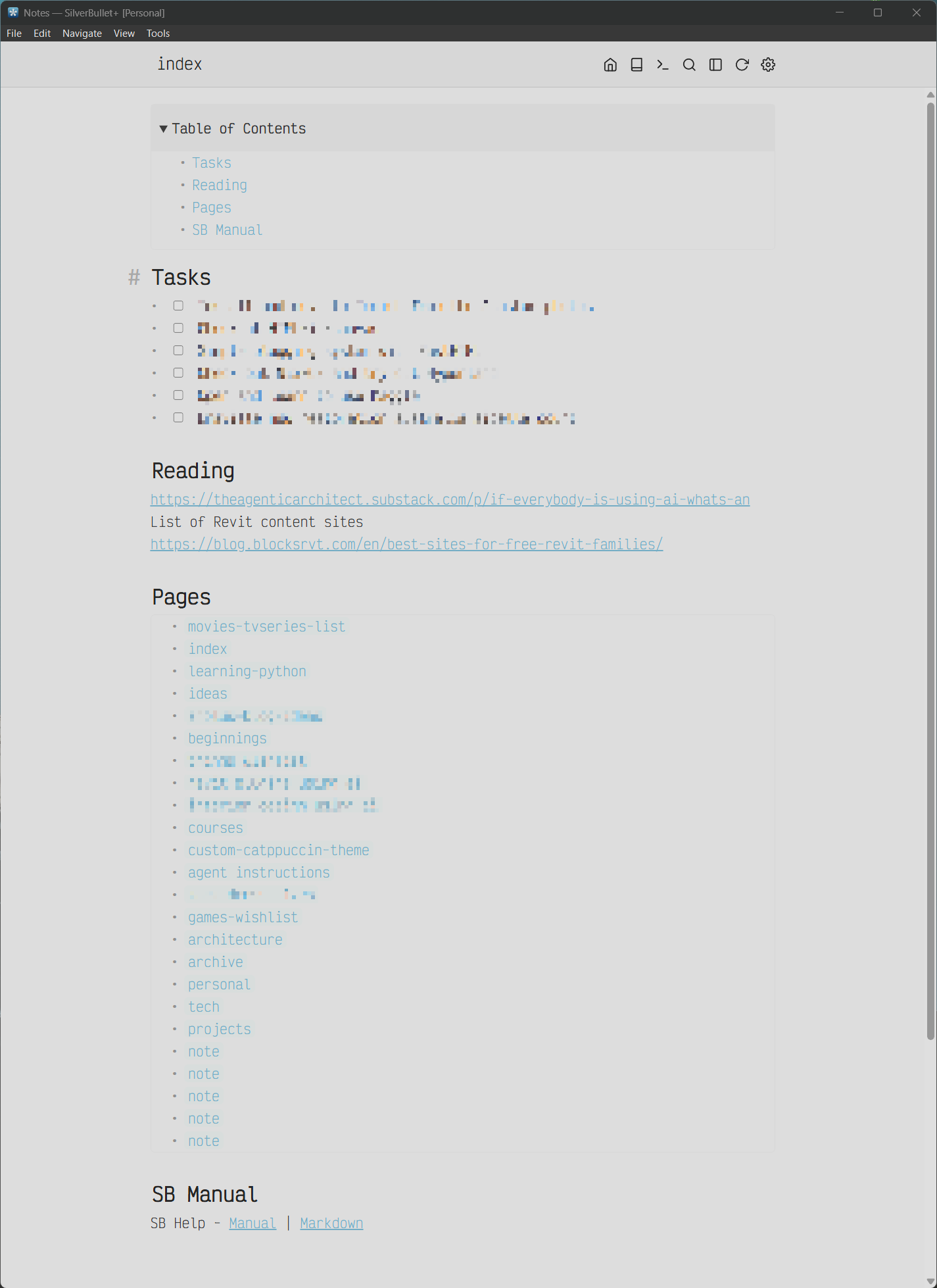
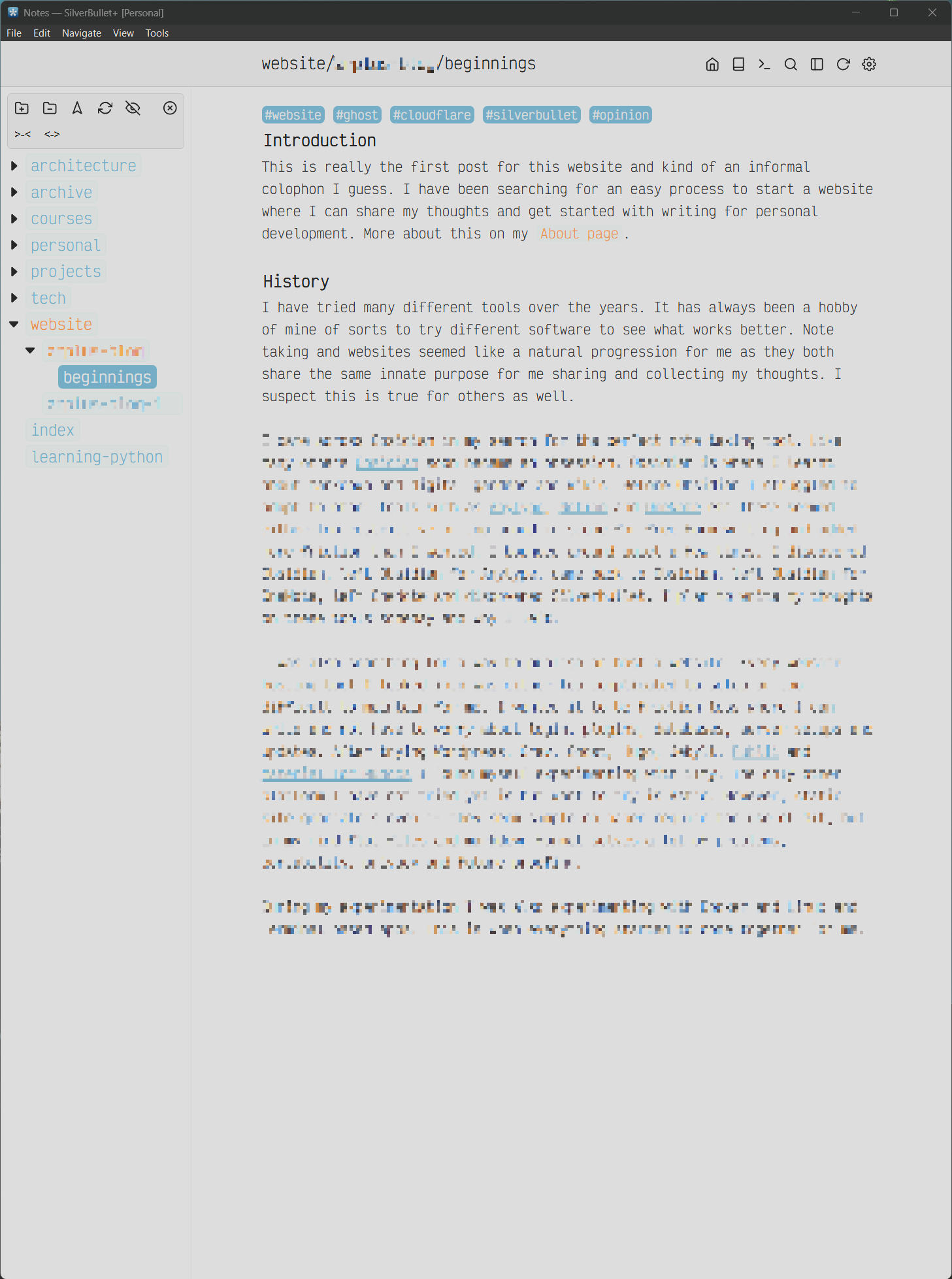
Here are some pictures of my setup:
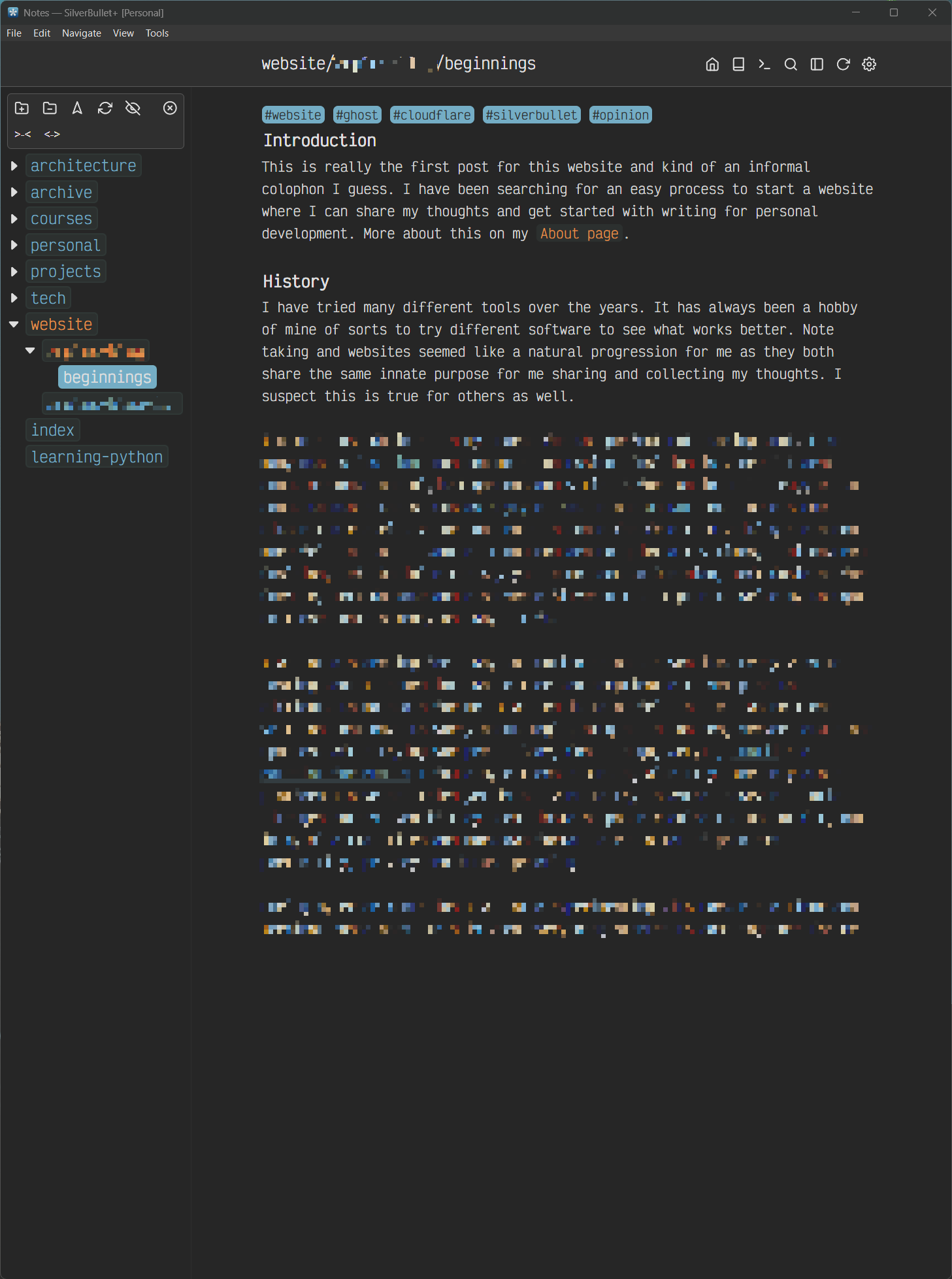
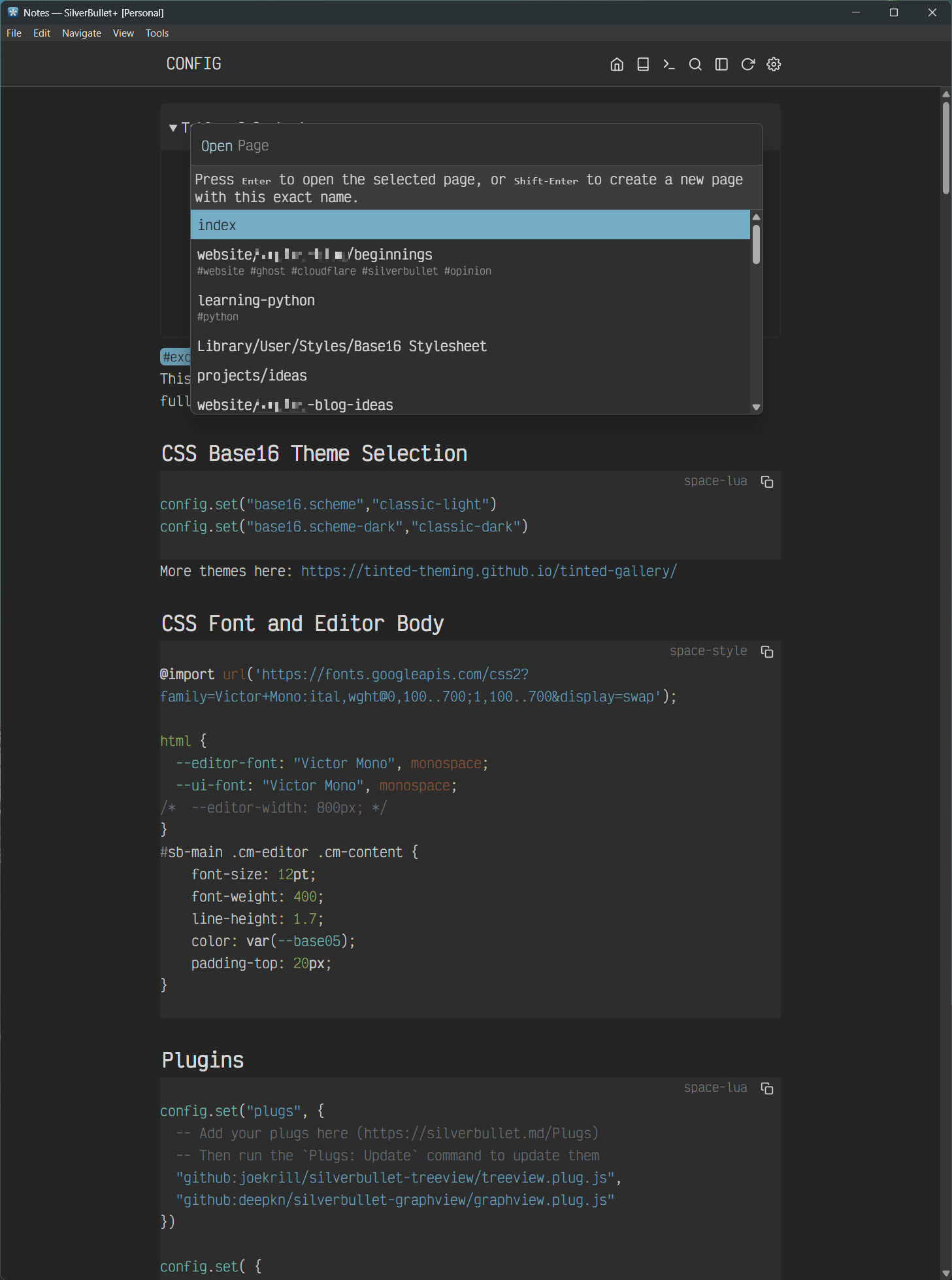
Plugins I use: TreeView and Silversearch. I have all the official plugins installed but do not use them as much.
Style changes:
- Google Fonts "Victor Mono," including some edits to the font size, weight, padding, and line height.
- Additional menu bar buttons.
- Font size changed for the menu title on the menu bar—previously, I had an auto-hiding top menu bar based on one of Mr. Red’s CSS snippets here: https://community.silverbullet.md/t/auto-hide-menu-bar/3170.
- Some minimal styles applied to the borders of the popup modals. Previously, I had hidden the help text for the popup with no border and a Mica-style translucent, blurry background with an appearance animation and some smooth shadows. I also had the popups centered vertically, but it made the popup jarring if the list became too short. It looked amazing, but this effect does not work properly for the Linux version of the SB+ app, so I decided to lose it.
- Lastly, I am also using the Base16 theme loader from this post: https://community.silverbullet.md/t/base16-theme-library-update/3218. I had to modify it because the dark theme would not work; I also added some additional colors for the admonitions and a few other things using Claude Code. I also noticed text looks far sharper on a 4K monitor in dark themes than in any light theme.
The reason I reverted some of my styling to be more default is that I noticed SB is still under heavy development, and I actually like most of Zef’s defaults. I am a believer that sane defaults are what make great software great.
Wishlist items:
- I love the paragraph or line highlight effect that iA Writer has. I tried to add this using CSS, but without the proper CSS selector for the CodeMirror text style (or whatever it is called), it worked unreliably. I would love to see this feature added or someone making a CSS style that makes this work reliably.
- I also love the animated cursor motion in Neovide, but that is asking for too much, as I realize that seems too far-fetched for what SB actually is.
- I would also like to see a CSS selector added for the modal close so I can apply a closing effect to all the modals.
- Whenever I load SB, there is a split-second transition for the theme to take effect. I realize the priority number to load the CSS might need to be higher, but it still does not work for me.
- The ability to hide the top menu bar for distraction-free writing to be a built-in feature.
- Lastly, better documentation, especially around space-script and some of the built-in functions. I know this is very hard for a single-person open-source dev to complete, especially with all the continuous updates, but a man can wish.
Thanks ![]() Zef for a wonderful piece of software and a gift to the community. I will try and donate some amount in the near future.
Zef for a wonderful piece of software and a gift to the community. I will try and donate some amount in the near future.